Experts panel
This article has been written and edited by SEO & content specialists and reviewed by field experts.

Jelle van Santen (Article author)
Data Analyst and Content Marketing Specialist

Jairo Guerrero (Content reviewer)
Helping CEOs With Their SEO | Growing Websites Traffic x10 With 90-Day Content Sprints | Achieved +5M Revenue With SaaS & eCommerce SEO Campaigns | Trained +100 Companies | SEO Capitan & Founder @ Phanum
Most eCommerce navigation menus are terrible for SEO
That is a bold statement, but I have just seen too many eCommerce navigation designs which are just hurting people’s SEO.
But how so?
Too many webshops are using a mega menu, while this navigation design often does more harm than good for your eCommerce site structure.
In this article, I will explain why mega menus are not optimal for SEO and which 3 best practices you should take into mind when designing your eCommerce navigation menus.
In short: you will want to read this article if you want to find out how you can optimally structure your eCommerce navigation to boost your SEO.
Let’s get started.
Table of contents
Why webshops shouldn't use mega menus
What your eCommerce navigation should look like
3 Best practices for eCommerce navigation menus
   Use a horizontal navigation menu on top and a vertical navigation menu on the left
   Use categories and sub-categories
   Use relevant keywords for your (sub-)categories
Final thoughts
Why webshops shouldn’t use mega menus
While you might see that many eCommerce sites have a mega menu on the top of their site, it is often not the right navigation style for many eCommerce sites.
“But why shouldn’t I use a mega menu if all the big eCommerce sites are using it?” You might ask.
That is because these big online retailers often have their own custom-developed navigation menus. While many smaller eCommerce stores use a standard template with a mega menu that is not optimized for SEO.

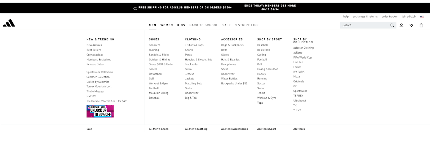
What a mega menu of Adidas looks like when you hover over it
When you use a mega menu, this menu will appear on every webpage, including the links to all your categories and subcategories. Especially for larger eCommerce businesses, this can lead up to a lot of internal links.
What then happens is that when a search engine crawls your website the crawlers will find the same internal links on each webpage, again and again. This results in 2 issues for SEO:
Issue #1 Messed up internal linking structures
This prevents you from structuring your internal linking so that your most important pages have the most amount of internal links. It is crucial to have the highest number of internal links to your most important categories or subcategories, to make it as clear as possible for search engines that these pages are the most relevant to show in the search results.
Issue #2 Non-relevant links on every page
If your categories are not extremely relevant to each other, chances are high that on every page there will be a lot of links that are not related to the category or product you want to highlight. This way, search engines understand the page less, which makes it rank lower in the search results.
What your eCommerce navigation should look like
So, instead of mega menus, you want to have a horizontal navigation menu on top of the webpage and a vertical navigation menu on the left of the webpage. In practice, a great SEO-proof navigation menu for most eCommerce websites looks something like this:

Use a top navigation menu with main categories
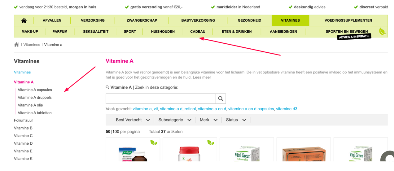
For this eCommerce store, Phanum implemented a top navigation menu with only the main categories and a navigation menu on the left with only the relevant subcategories. This is different from the mega menu navigation design as this top menu will not display any sub-categories when you hover over the top menu.
The top navigation menu will be displayed on every page, resulting in a ton of internal links for the main categories of the webshop. By doing this, the categories are marked as more important pages than the sub-categories, something which is very beneficial for SEO.
Use a side navigation menu on the left for sub-categories
The navigation menu on the left will depend on the category page you are on at that exact moment. Let’s say you are on the homepage of this eCommerce store and click on the category vitamins, you will go to the vitamins category page. On this page, only the subcategories of vitamins are shown on the left and not the subcategories of other categories.
This results in hyper-relevant links for the category vitamins, which is very valuable for search engines and will lead to higher rankings for your categories. Whenever you click on another category, a new page will appear with only the relevant sub-categories for that category, which will be great for improving the ranking of that specific category.
3 Best practices for eCommerce navigation menus
Now you understand what the ideal navigation menu is for most webshops, but what are the 3 most important best practices?
- Have a split navigation menu
- Use of categories and sub-categories
- Use relevant keywords
Have a split navigation menu
As discussed before, it is better to have two different navigation menus. One on the top of the site and one on the left. While this may be different from many of the big eCommerce sites, it is much better for your SEO than mega menus. But why?
This works best for most eCommerce websites because:
- Improves the hierarchy based on page importance
- Increases the number of relevant internal links
- Improves SEO tremendously
- Doesn’t negatively affect user experience
Use categories and sub-categories
In order to have the best experience for your users and suit the needs of search engines, you should have a combination of categories and sub-categories in your navigation menu on the left. This makes it easier for users to browse through all the products you offer plus it gives search engines the opportunity to understand which categories and sub-categories are related to eachother.

The main categories should be named after the broader product categories you offer. These categories can be based on the actual type of products themselves. Or for eCommerce businesses that offer products for different niches the categories can be based on the specific niche.
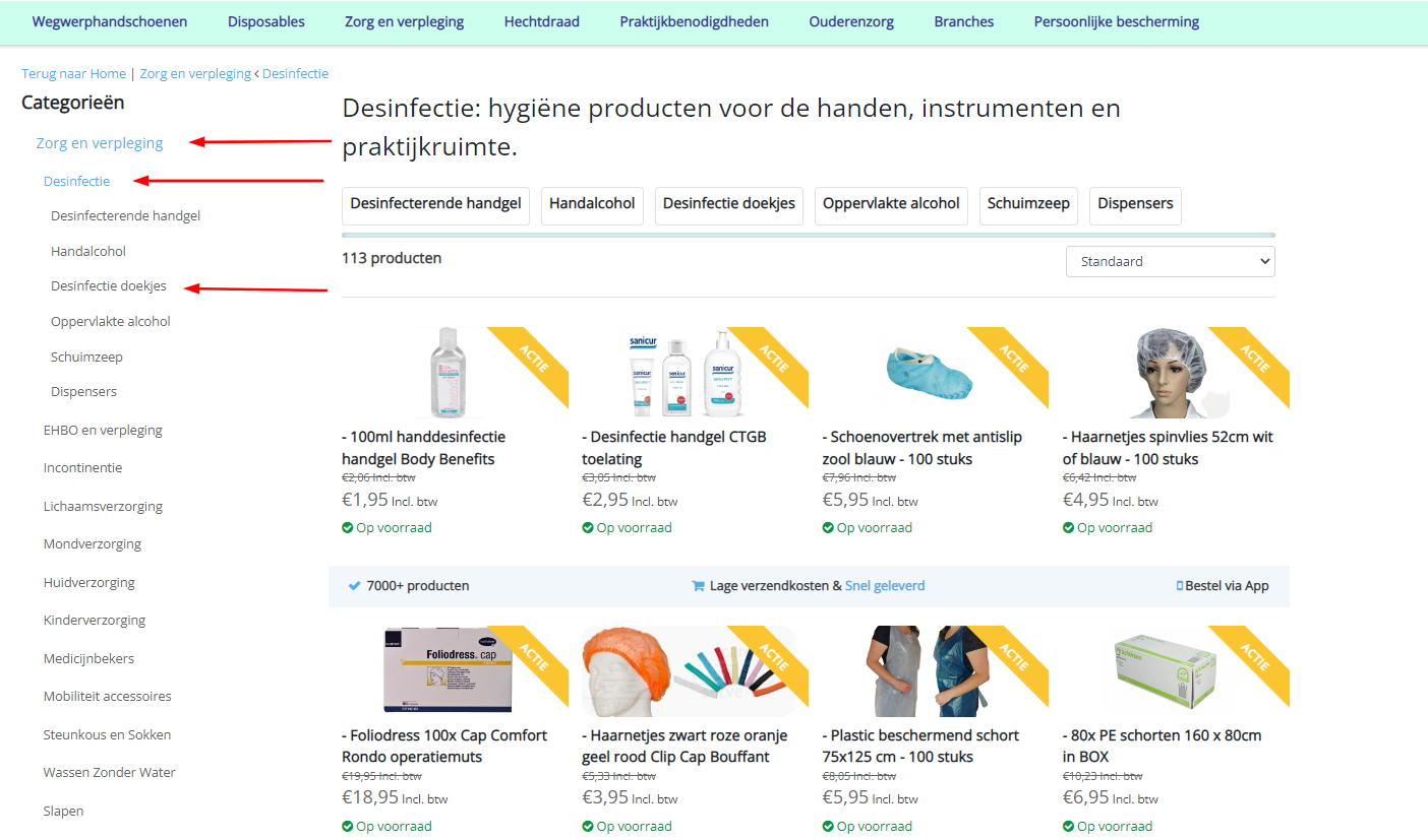
In the example, above you see the category “Zorg en verpleging” in which you can find the sub-category “desinfectie”, herein you can even find the sub-sub-category “desinfectie doekjes”
Sub-categories should be directly related to the main category they fall under. For example, you do not want to have a main category named “Fruits” and a direct sub-category that is named “Terriyaki Beef Sauce”. Instead, you want to have subcategories such as “Apples”, “Pears” and “Mangos” under “Fruits”.
This practice will give your visitors the chance to navigate your site easily. Plus! It will give search engines the opportunity to understand your eCommerce website better, which will result in higher rankings of your products in the search results.
Use relevant keywords for your (sub-)categories
Related to the previous best practice, it is crucial, to name your (sub-)categories in the navigation menu based on keywords relevant that you will want to rank for. If you really want to increase your webshops visibility in search results you should name your (sub-)categories with the right keywords based on:
- The relevance to your product offering
- The number of monthly searches
- The difficulty of ranking for that specific keyword (Aka: how tough is the competition)
- The number of products you can offer in a certain category

An easy way to cheat your way around keyword research is to copy your competitors’ categories. If they use it, it is probably correct…right?
Well actually… it is not that simple.
Search behavior changes over time and what may have worked a year ago, may not work now. Also, when you copy your competitors, there is no way for you to tap into opportunities that are sometimes there for the taking. Therefore, I do recommend doing your own research, to exactly understand what keywords would work best for your specific situation.
Final thoughts
A mega menu is not ideal for most eCommerce stores since this most often causes problems for the internal linking structure of your site. To prevent this from happening you should consider implementing a more simple, yet more effective, navigation design with a menu on the top, plus a menu on the left of the screen.
If you found this article interesting to read, you should consider reading our article on performing an eCommerce audit to boost your SEO. This article includes a 15-step checklist to improve your eCommerce site’s SEO.
Or read this blog post about the 5 best SEO tools for webshops that will help you speed up your SEO processes so that you save time and don’t make decisions based on guesswork.
If you have made it this far through the blog…
Chances are that you are seriously looking to improve your SEO game. That’s great we are here for it!

Book a meeting with us, let’s talk SEO!
Or learn more about your future SEO Strategist: Jairo Guerrero.


About The Author: Jelle van Santen
Jelle van Santen is a freelance content marketer who boosts innovative B2B startups with smart SEO and creative content strategies. He has master's degrees in marketing and business analytics and enjoys sharing his best insights on SEO, content, analytics, and marketing technology.
More posts by Jelle van Santen